Jett Financial | LPL
Objective: To leverage aviation-themed imagery that communicates upward trajectory and navigational precision while maintaining the trustworthy and secure presence of an established wealth management firm.
Solution: This series balances dynamic flight metaphors—representing financial growth and agility—with structured, bold typography and a professional navy palette to reinforce fiduciary discipline and institutional stability. The resulting marks position the firm as a reliable partner for clients seeking both momentum and long-term asset protection.
Iron Point Northwest | LPL
Objective: To establish an identity conveying steadfast direction and enduring stability, reflecting the firm's location and commitment to long-term wealth preservation.
Solution: This exploration integrates symbols of guidance (compass roses, true north points) and resilience (mountains) to symbolize fiduciary foresight and secure financial planning. The palette of cool, slate blues reinforces institutional strength and trust, presenting the firm as a grounded and reliable guide in a changing market.
ValeMont Private Wealth | LPL
Objective: To design a sophisticated visual identity for a private wealth practice that reflects exclusive service, market longevity, and a high level of fiduciary care.
Solution: This series utilizes architectural monograms and sharp, geometric forms to symbolize a foundation of security and structured growth. The use of refined serif typography and a muted, professional color palette communicates institutional prestige and discreet reliability, positioning ValeMont as a premier partner for high-net-worth asset management.
Piedmont Capital Advisors | LPL
Objective: To develop a versatile brand mark that communicates capital preservation and strategic growth while reflecting a sophisticated, boutique advisory approach.
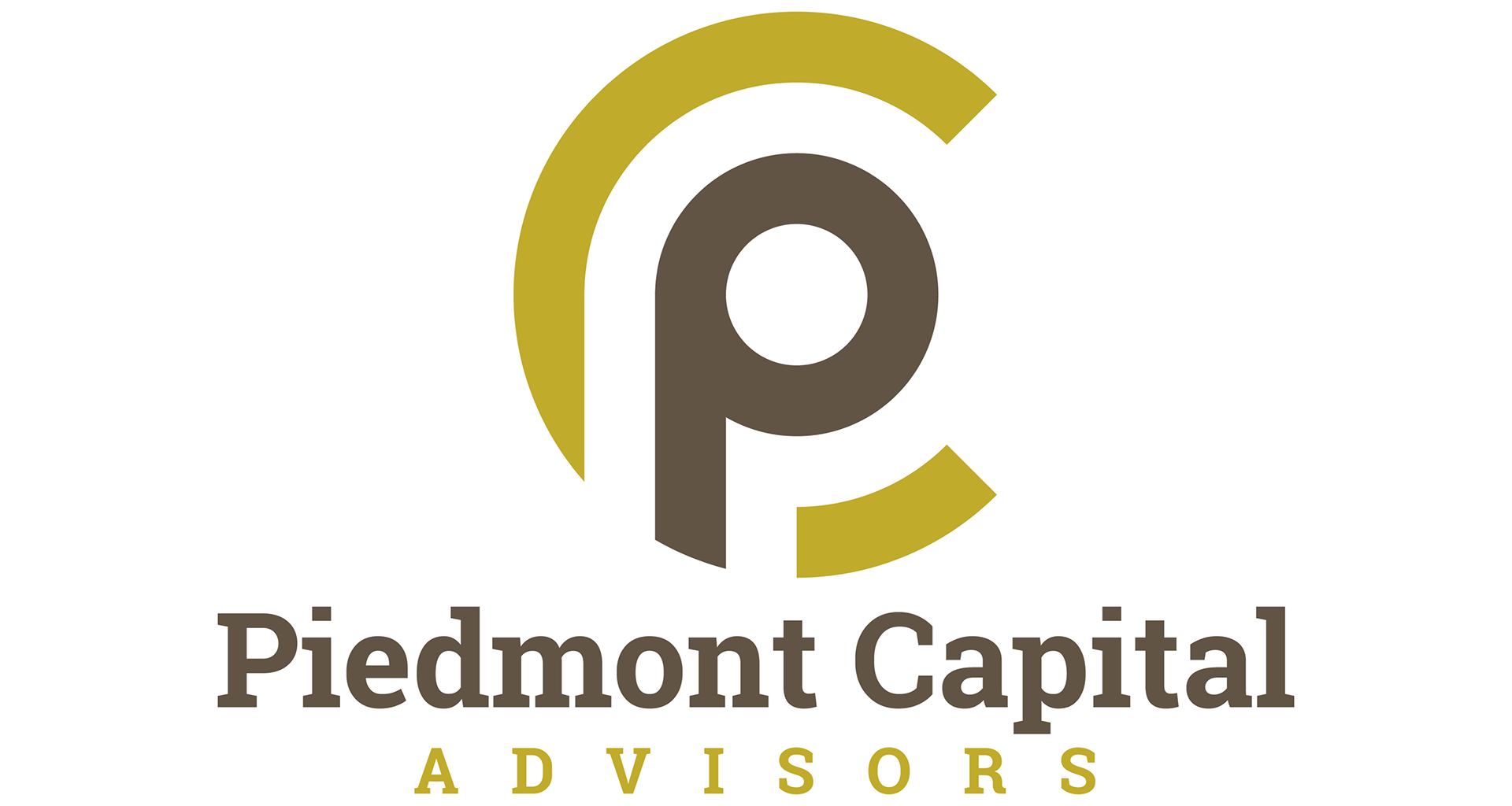
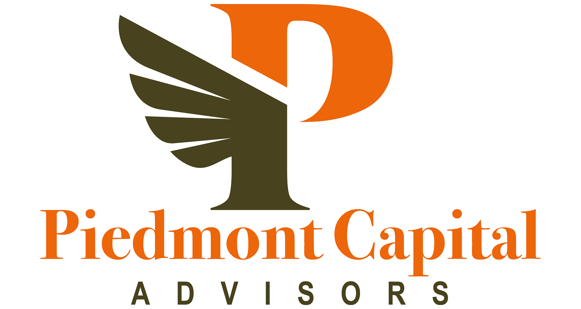
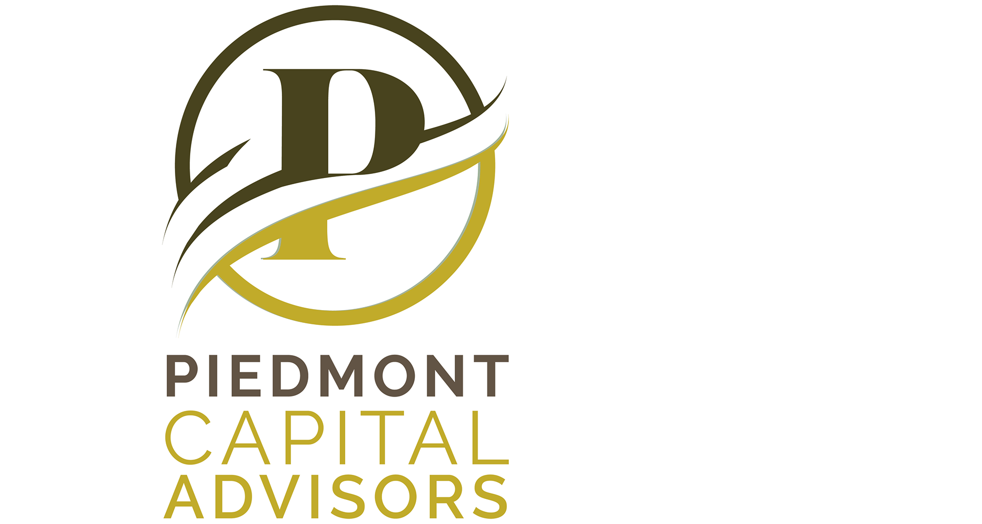
Solution: This series focuses on interlocking letterforms and swooping architectural curves to symbolize the fiduciary connection between advisor and client. By utilizing an earthy, olive-and-gold palette, the designs convey wealth stability and organic growth, providing a warm yet professional alternative to traditional corporate blue while maintaining a sense of institutional integrity.
Pecoraro Wealth Management | LPL
Objective: To design a powerful visual identity that captures market confidence and bullish growth while maintaining a foundation of institutional security.
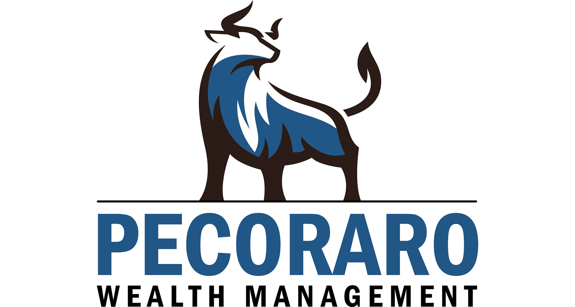
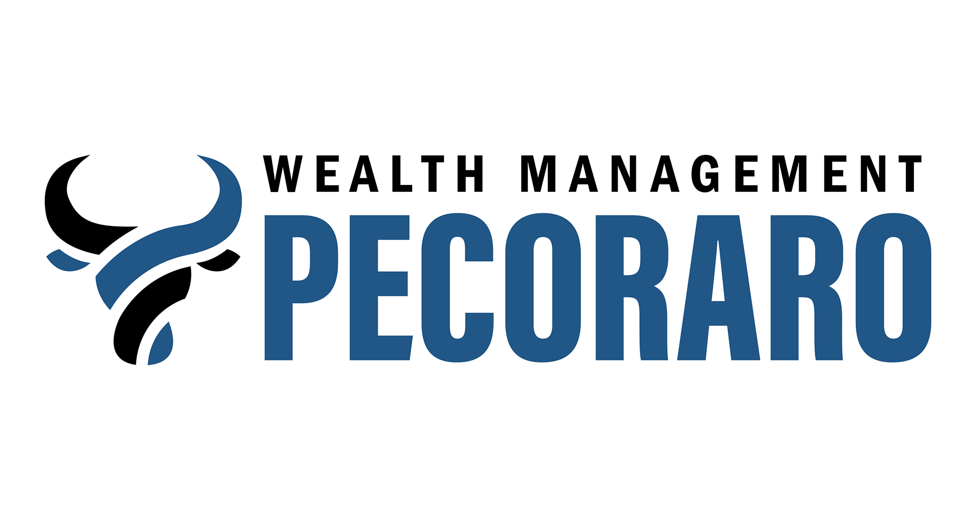
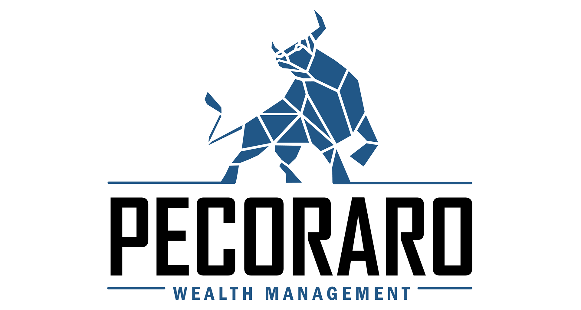
Solution: This series utilizes the bull as a primary metaphor for financial strength and upward momentum. Through a progression of illustrative styles—from a traditional, solid silhouette to a modern, geometric facets—the designs represent analytical precision and resilient wealth management. The bold, block typography and deep blue palette anchor the imagery, reinforcing the firm’s commitment to fiduciary discipline and long-term stability.
Palm Capital Wealth Management | LPL
Objective: To create a visual identity that balances regional approachability with the trustworthy and secure nature of high-level asset management.
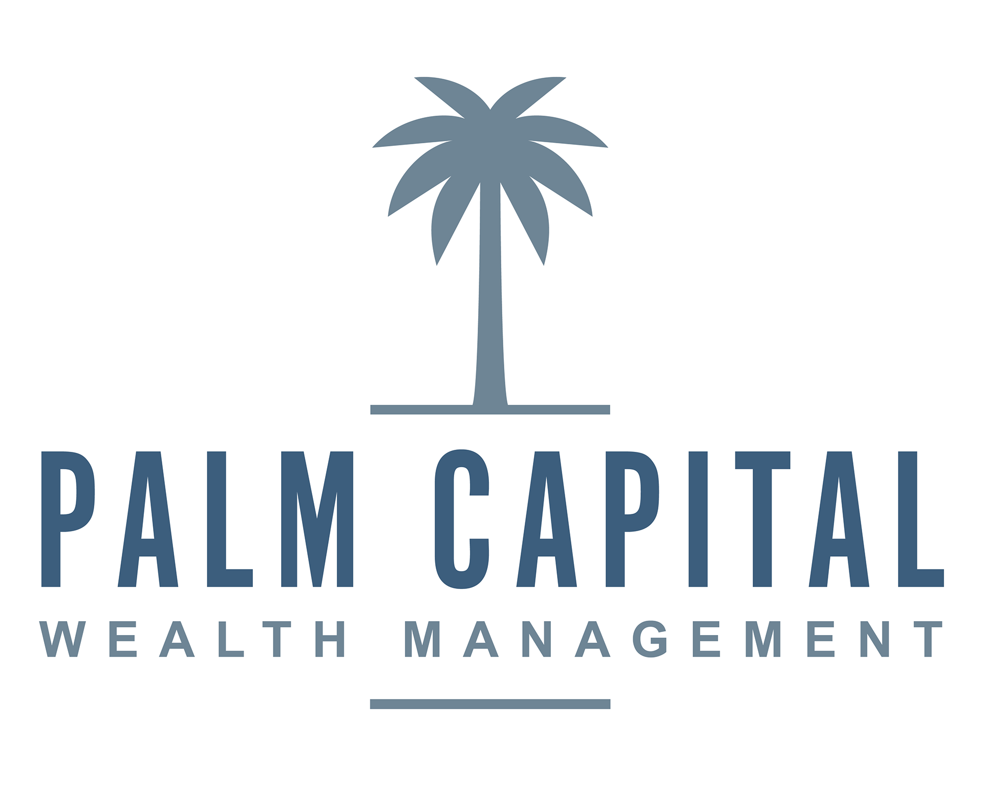
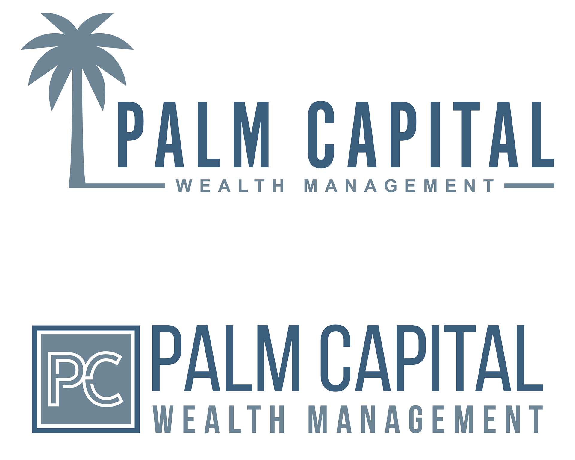
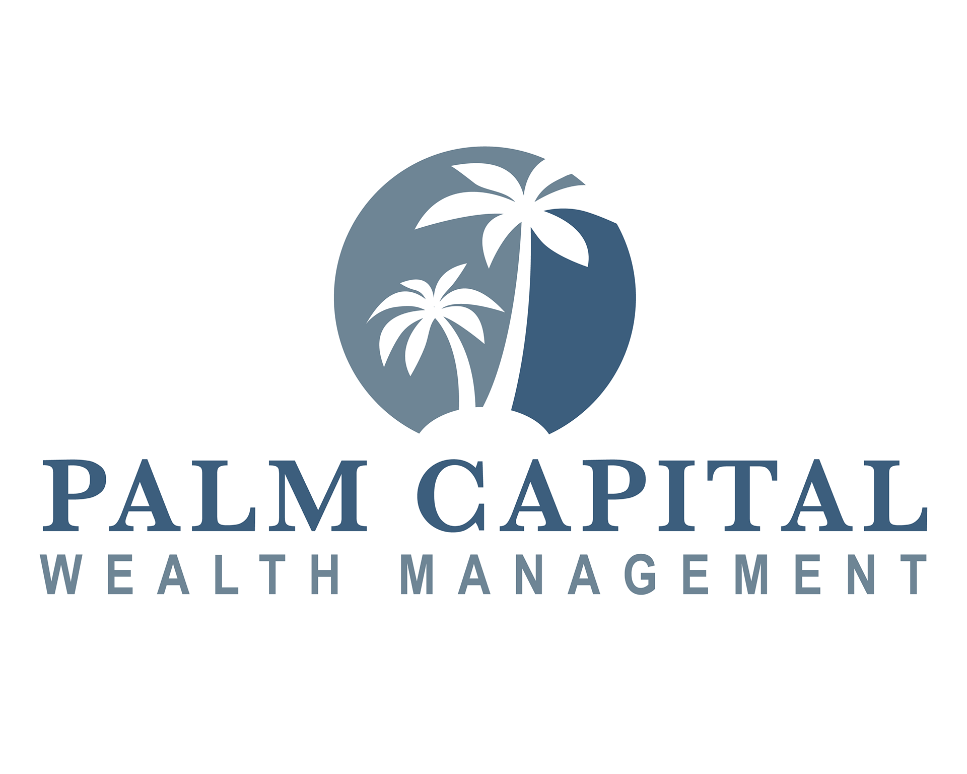
Solution: This series uses the palm tree as a symbol of resilience and sustainable growth, framing it within structured, architectural layouts to reinforce fiduciary stability. The clean, sans-serif typography and professional slate-blue palette distance the brand from casual hospitality, instead projecting a sense of institutional integrity and a disciplined, long-term approach to wealth preservation.
Expedition Wealth Partners | LPL
Objective: To establish a visual identity that frames wealth management as a guided journey, emphasizing navigational expertise, long-term perspective, and unwavering security.
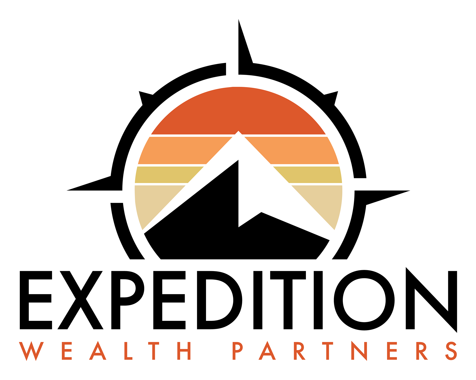
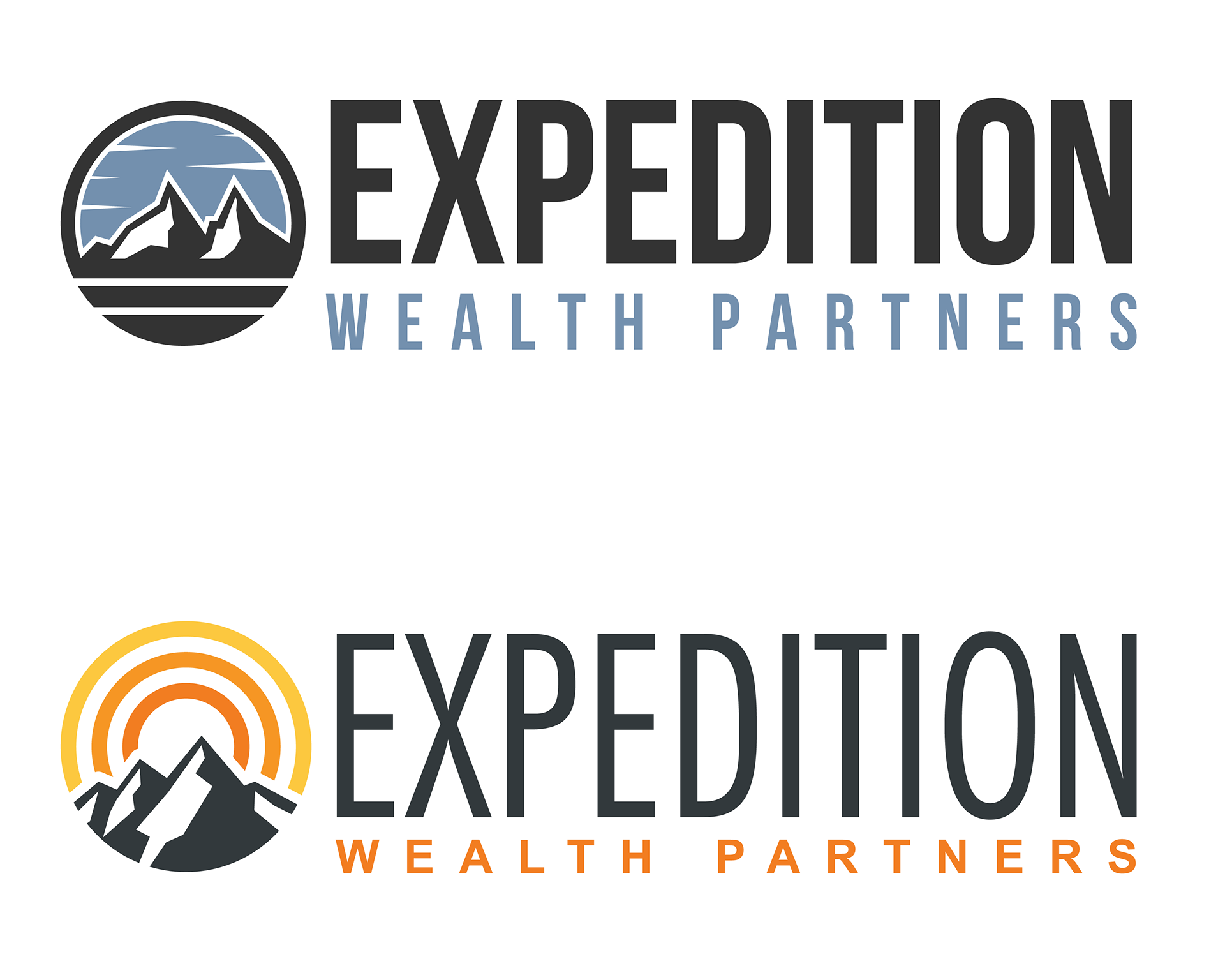
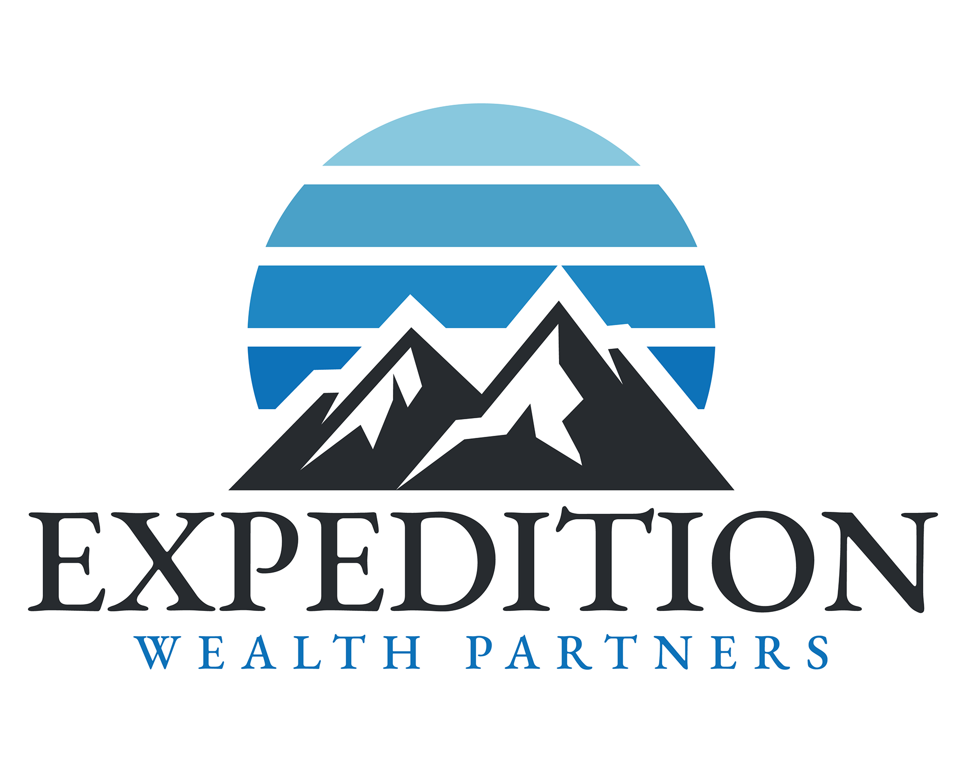
Solution: This series integrates imagery of rugged mountain peaks and compass elements to symbolize fiduciary guidance and the successful scaling of financial goals. By utilizing a balanced palette of sunrise oranges and institutional blues, the designs communicate both the upward momentum of market growth and the grounded stability required for asset protection, positioning the firm as a reliable partner for complex financial treks.
Headwaters Wealth Management | LPL
Objective: To design a visual identity that symbolizes the source of financial clarity and the steady flow of capital, emphasizing the firm's role in long-term wealth preservation and generational planning.
Solution: This series utilizes fluid, wave-like forms and layered horizons to represent market liquidity and transparent asset management. By pairing an organic teal and earth-tone palette with structured, bold typography, the designs communicate a sense of natural growth underpinned by fiduciary stability, positioning the firm as a reliable and calming guide through changing financial currents.
GreenPoint Wealth Management | LPL
Objective: To establish a visual identity that highlights responsible growth and structural integrity, positioning the firm as a cornerstone for long-term wealth preservation and sustainable financial planning.
Solution: This series utilizes architectural monograms and isometric "GP" letterforms to represent a solid foundation of capital security. By pairing forest green and slate blue tones with clean, modern typography, the designs communicate a balance of organic wealth accumulation and institutional discipline, ensuring the brand feels both approachable and profoundly reliable.
Graceful Wealth | LPL
Objective: To design a sophisticated identity that communicates nobility of purpose and capital strength, positioning the firm as a high-level guardian of legacy and multi-generational wealth.

Solution: This series utilizes heraldic symbols—the lion and the gryphon—to represent fiduciary courage and the steadfast protection of client assets. By pairing a rich gold leaf palette with elegant serif typography, the designs project a sense of institutional prestige and timeless reliability, ensuring the brand feels both authoritative and deeply committed to a graceful, disciplined approach to wealth management.
Gainwell Capital Partners | LPL
Objective: To develop a modern, tech-forward visual identity that emphasizes strategic accumulation and interconnected wealth solutions, positioning the firm as an innovative leader in capital management.
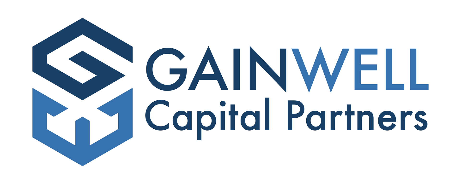
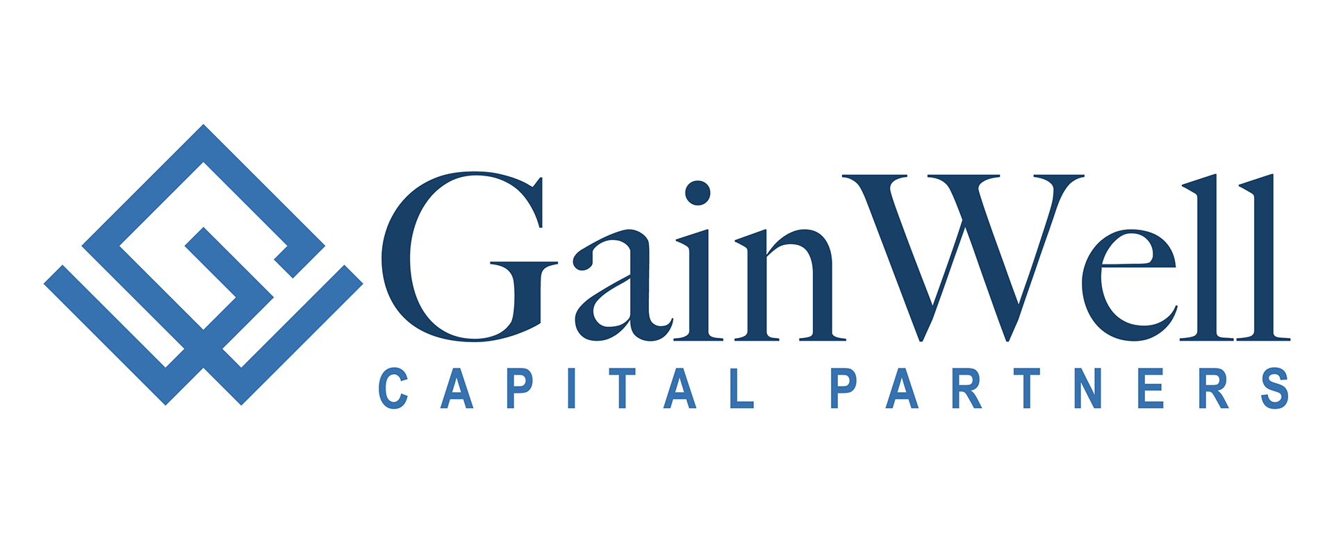
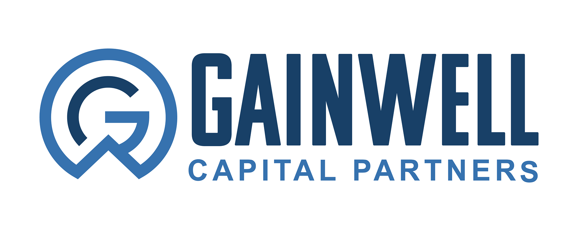
Solution: This series explores interlocking "GW" monograms through various geometric frameworks—isometric cubes, diamonds, and circular nodes—to symbolize structured growth and institutional synergy. The use of a crisp, dual-tone blue palette communicates analytical precision and trustworthy oversight, ensuring the brand projects a highly organized and reliable approach to complex financial partnerships.
Dempster & Floyd | LPL
Objective: To design a sophisticated, legacy-focused identity that reflects partnership-driven wealth management and a commitment to institutional stability.
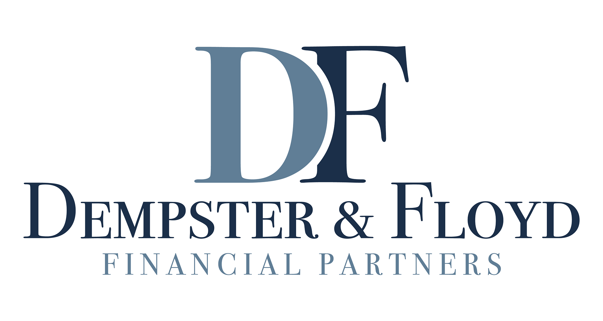
Solution: This series utilizes elegant, overlapping serif monograms to symbolize the fiduciary relationship and the seamless integration of diverse financial strategies. By using a classic navy and slate palette with refined, high-contrast typography, the designs communicate trustworthy oversight and prestigious reliability, positioning the firm as a grounded and professional anchor for its clients' long-term financial goals.
CWM Planning | LPL
Objective: To establish a visual identity that emphasizes strategic architecture and structural asset management, positioning the firm as a cornerstone for building and protecting long-term wealth.
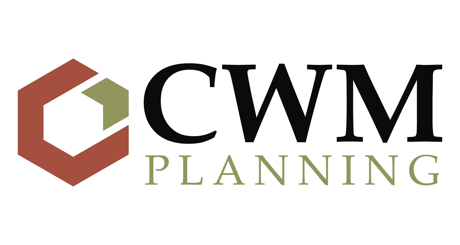
Solution: This series utilizes isometric cubes and interlocking geometric forms to represent diversified portfolios and capital security. By highlighting a "core" element within the larger structure, the designs symbolize fiduciary focus and analytical precision. The palette of slate, clay, and moss green provides an grounded alternative to traditional financial colors, projecting institutional stability and a disciplined, methodical approach to financial planning.
Creekside Financial Advisors | LPL
Objective: To design a visual identity that connects organic wealth accumulation with steadfast guidance, positioning the firm as a serene and reliable partner in navigating long-term financial landscapes.
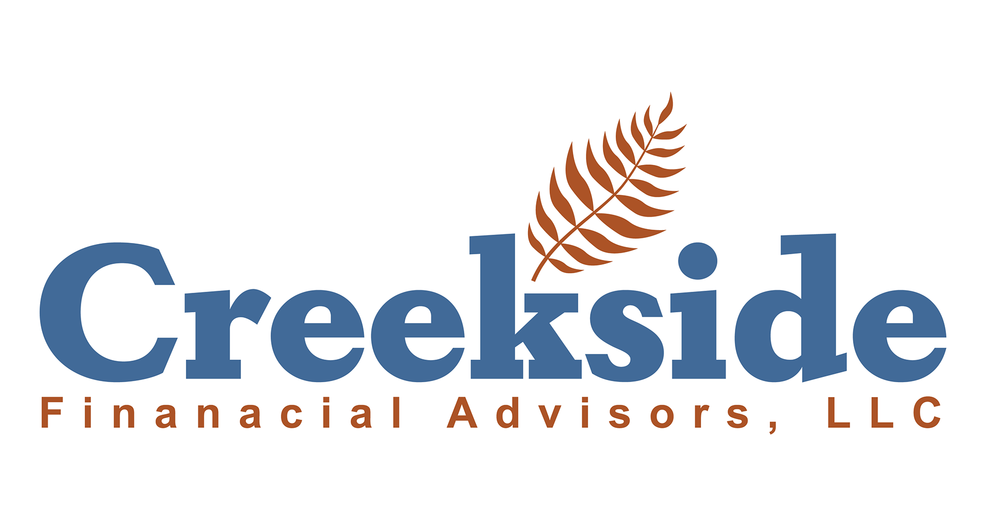
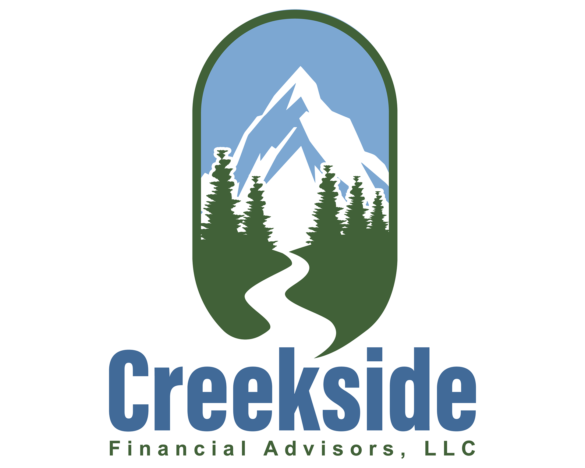
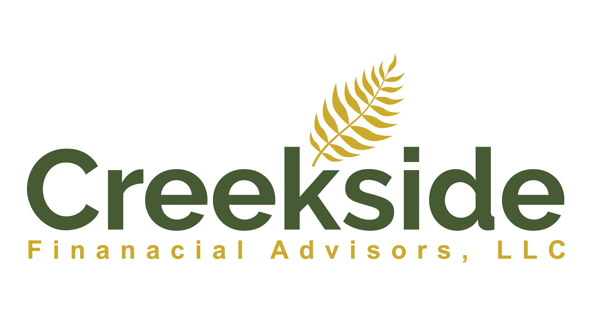
Solution: This series integrates natural elements—ferns and winding waterways—to symbolize financial liquidity and the sustainable growth of assets over time. By framing these organic forms within a structured badge or pairing them with bold, stable typography, the designs communicate a balance of fiduciary discipline and institutional security. The earth-toned palette of forest green, clay, and sky blue reinforces a sense of trustworthy oversight and grounded reliability.
Legacy League of Palomar Health | InnoVision
Objective: To create a spirited and cohesive identity for Palomar Health’s internal softball league that balances the professional medical heritage of the hospital with the dynamic energy of competitive sports.
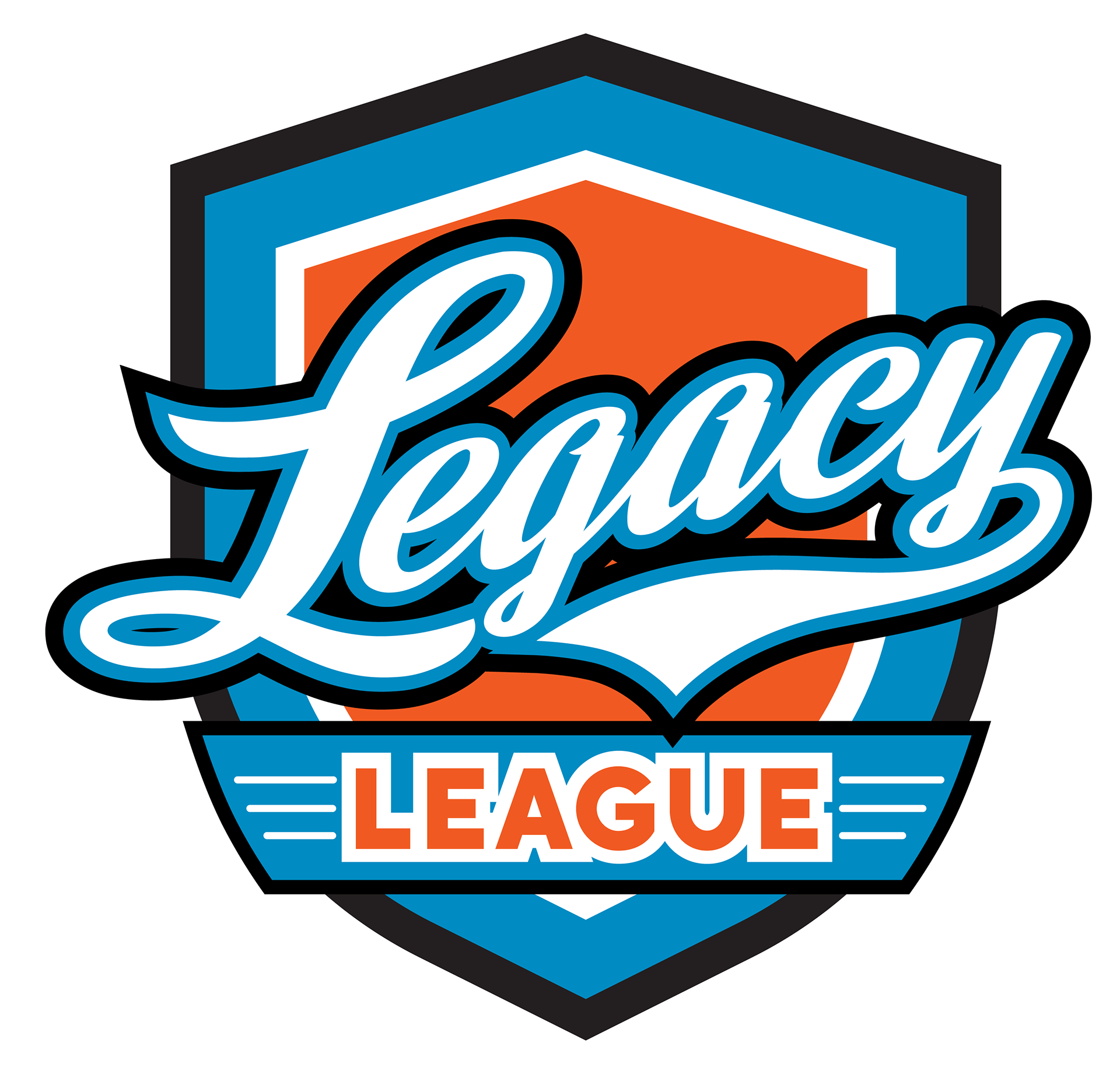
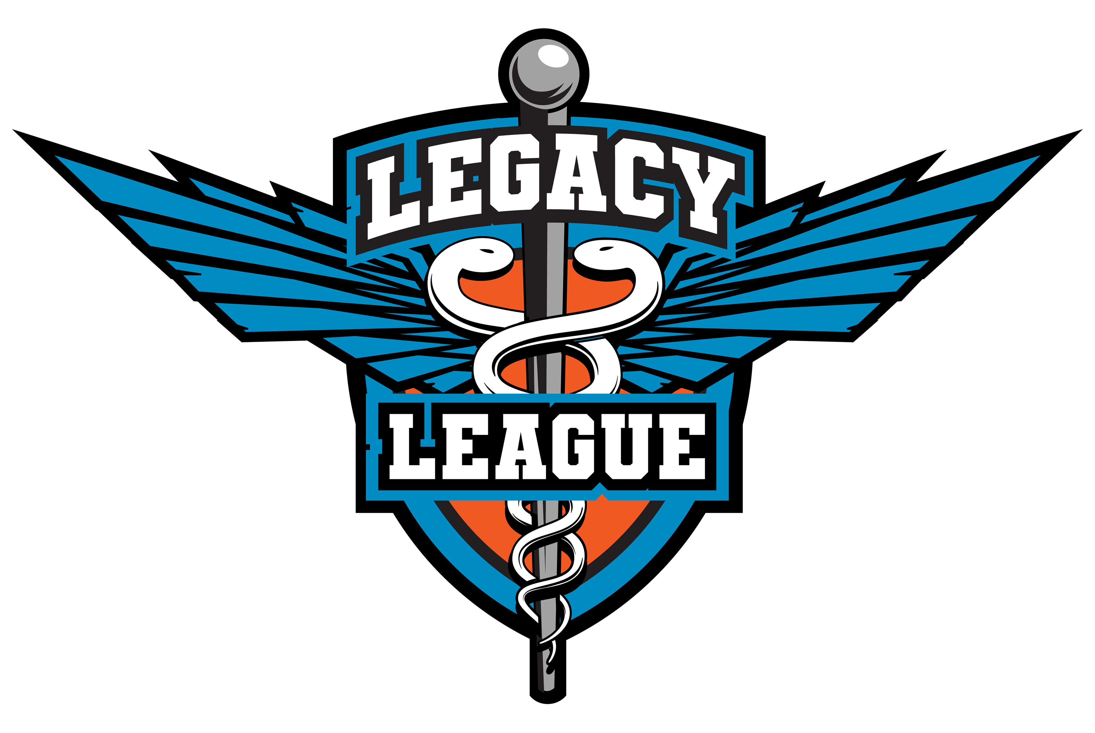
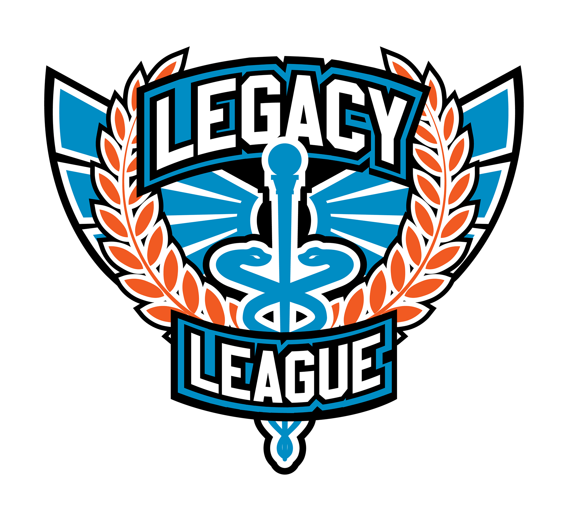
Solution: This series utilize classic athletic "shield" and "winged" motifs to represent teamwork and tradition. By integrating medical iconography—such as the Caduceus—into high-energy sports crests, the designs reinforce a sense of community and legacy. The vibrant blue and orange palette provides a bold, modern contrast, ensuring the brand feels approachable yet competitive for a healthcare-based recreational league.
Prohibition Coffee Co. | InnoVision
Objective: To design a gritty, high-octane visual identity for a boutique coffee brand that merges vintage "outlaw" culture with a passion for classic motorcycle mechanics and "Caffeine and Gasoline."
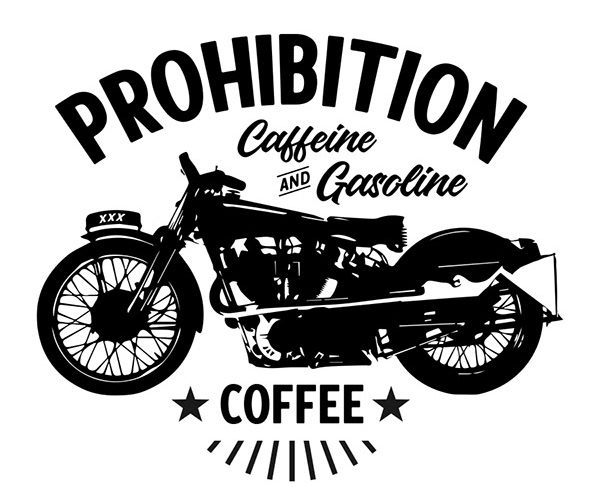
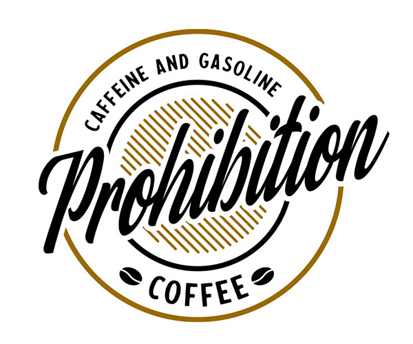
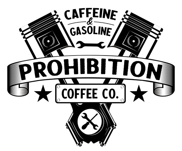
Solution: This series features hand-drawn, industrial-inspired illustrations, including a vintage bobber and V-twin engine pistons, to establish a rugged and authentic brand voice. By utilizing a high-contrast black-and-white palette and bold, wood-type-inspired typography, the marks project the energy of a heritage garage. The result is a lifestyle-centric identity that positions the product as more than just a beverage, but a fuel for a specific subculture of enthusiasts.
Cannon Beach Waterpark | InnoVision
Objective: To design a vibrant and energetic visual identity for a family-oriented waterpark that captures the excitement of "everything fun under the sun" while maintaining a cohesive, professional resort-style aesthetic.
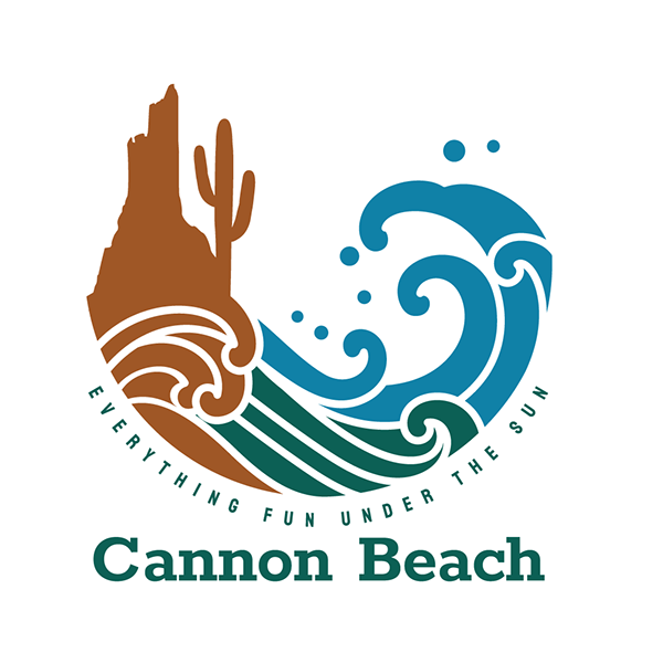
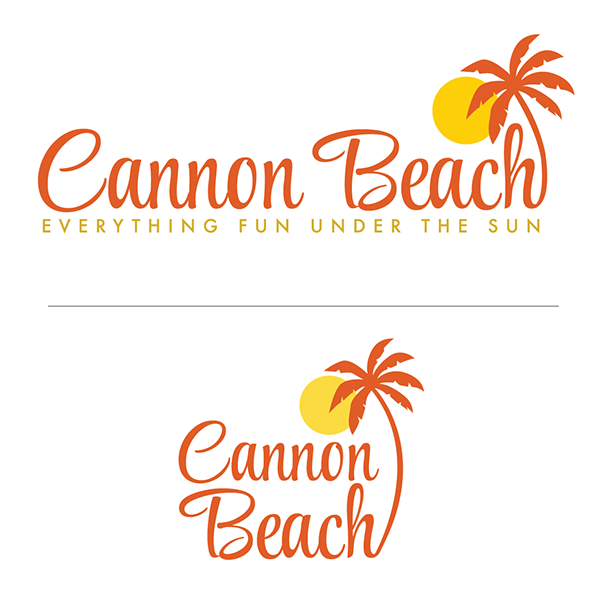
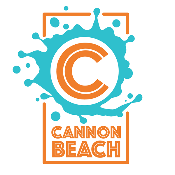
Solution: This series utilizes high-energy splash motifs and fluid wave illustrations to represent motion and immersion. By pairing tropical elements—like sun-drenched palms and desert rock formations—with bold, rounded typography, the designs communicate an approachable and adventurous atmosphere. The palette of bright teal and sunset orange ensures the brand feels contemporary and inviting, positioning the waterpark as a premier destination for leisure and recreation.
A few 'one-off' logos i've done over the years